We have finally hit summer here in Minnesota! Yay! We can finally get outside and enjoy what we have waited for all winter – haha! While you are out sipping some lemonade under an umbrella somewhere, we hope you enjoy this blog all about this beautiful bathroom remodel we completed in 2016!
The Before: Hello 1992!
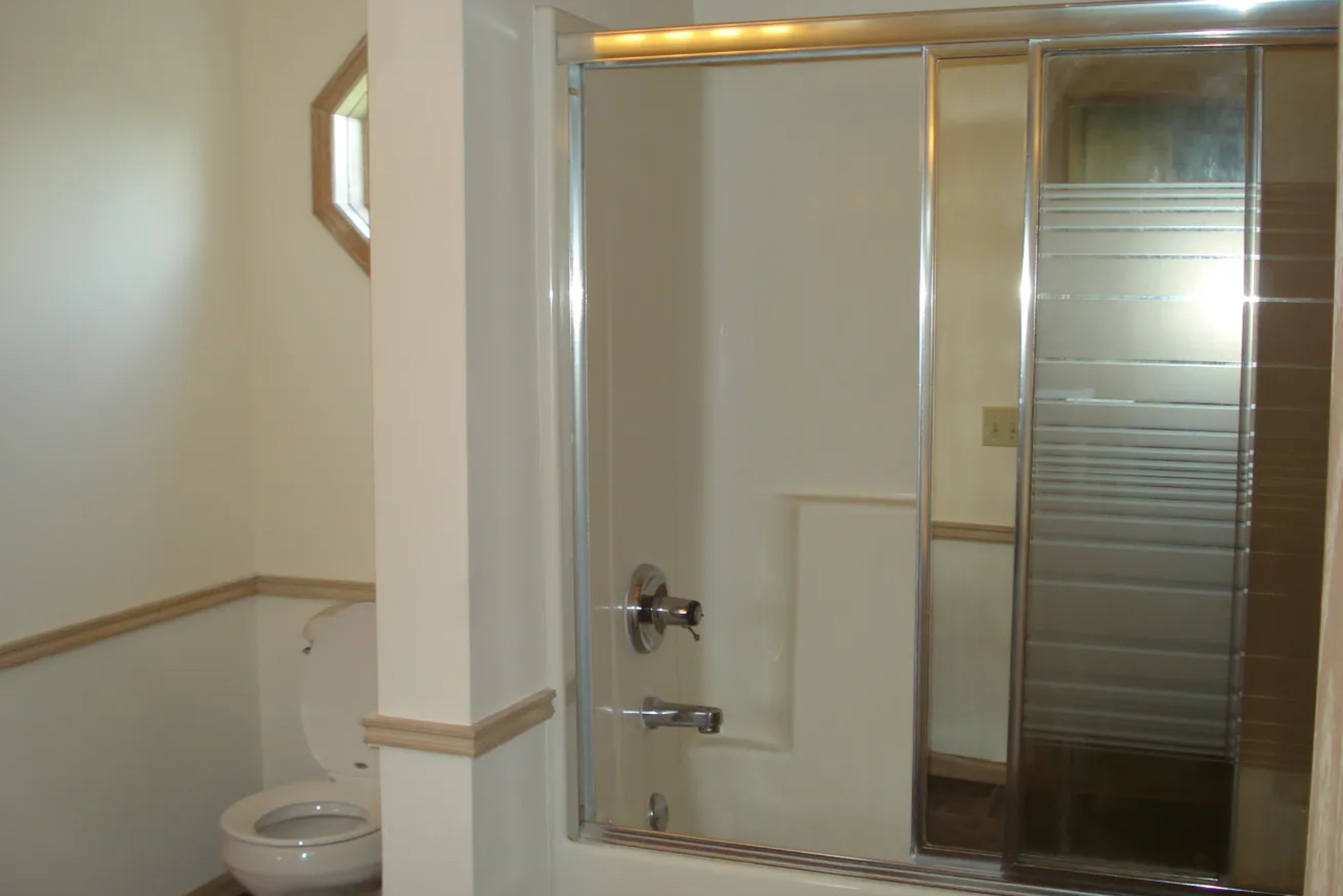
This home was built in 1992 and everything in this home was pickled oak – and not the pretty kind. As you can see in the before pictures below, the vanity only had 1 sink, there was a step to get into the tub and a very dated shower door. The great thing about this bathroom is that it was big, connected to both the master bedroom and the hallway, and the layout was good – it just really needed to be remodeled.
Check out that lovely chair rail and the Hollywood lights above the vanity! These things had to go!
After: Modernized & Improved
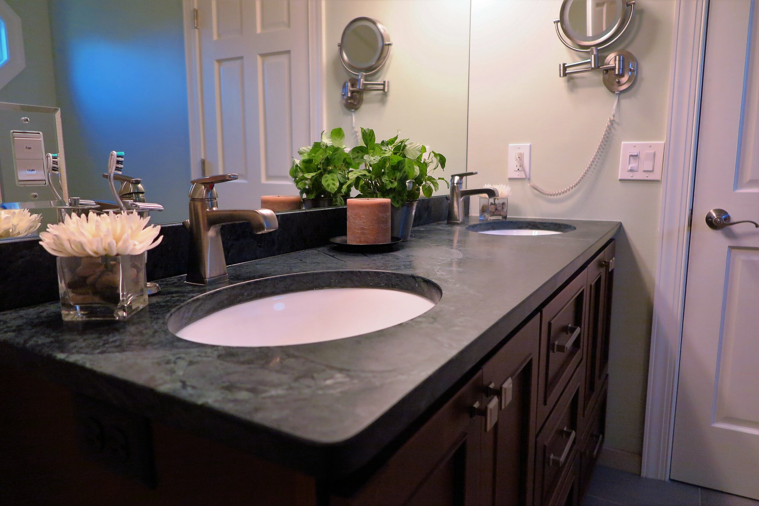
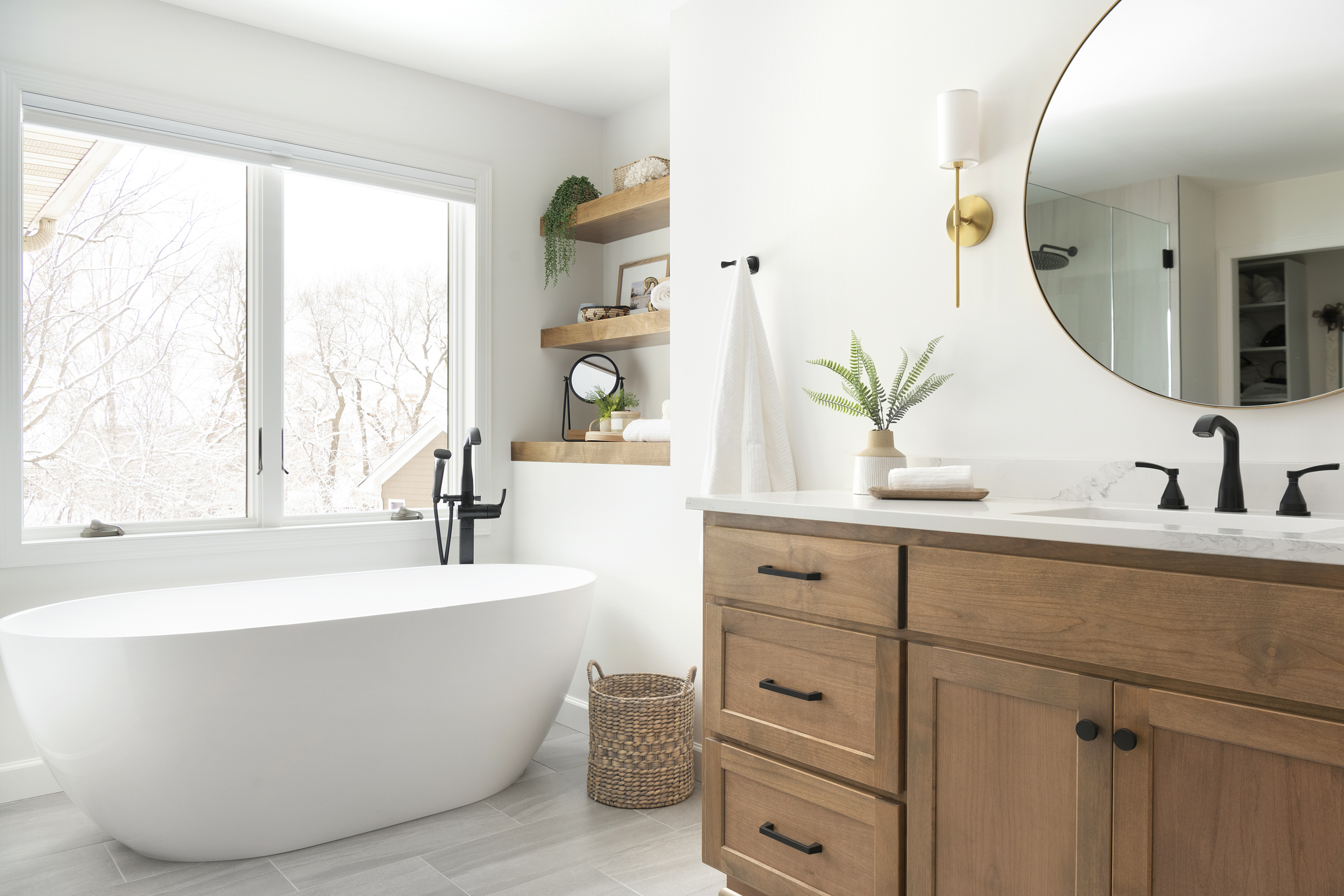
Once this bathroom was demoed – you can see how much it really opened up and made the room feel so much lighter! The area for the tub was pretty big, so we were able to get a wider, deeper tub installed. Also, the deco inserted into the floor – we just love this detail! You will see in the next photos that it follows up the wall in the shower! It really draws your eye up when you walk in through the door. The vanity now has room for 2 sinks and plenty of room for storage. The drawers underneath the sinks were specifically designed to hold rolls of toilet paper.

See how the deco tile draws your eye up? The ceilings are vaulted in this bathroom, so we took advantage of tiling the walls all the way up! It really makes the bathroom feel even bigger!
The vanity top is a green soapstone – the honed surface is so pretty! The vanity color is a warm brown, which allowed us to use some gray and cream tones throughout the rest of the bathroom and didn’t fight with it. We chose to go with one large mirror just to make the bathroom feel even bigger.
In the shower, we chose to go with this configuration for a shampoo shelf to allow for bigger bottles, little bottles, and everything needed in between. Another tile was added here – a copper penny round – just to add another element of interest into the space. The copper matches the copper in the accent tile that runs on the floor and walls.
Overall, we really love how this bathroom turned out. It really has a ‘rejuvenated’ feel to it and functions so much better for these homeowners and their family.
Your Apple Valley, MN Bathroom Remodel Resource!
If you are looking to remodel your bathroom – then look no further! White Birch Design would love to help you take your bathroom from 1992 Pickled Oak to the bathroom of your dreams! Contact us today to get the process started! We look forward to hearing from you.
